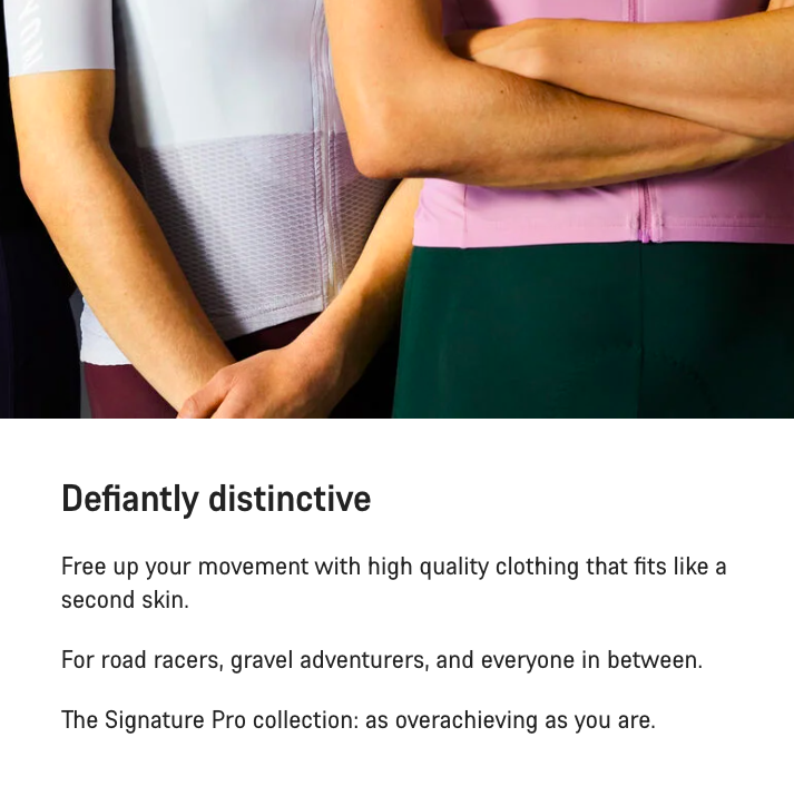
Clothing as art
The tagline I chose for this project, Flying Colours, was a play on the idiom "to pass with flying colours".
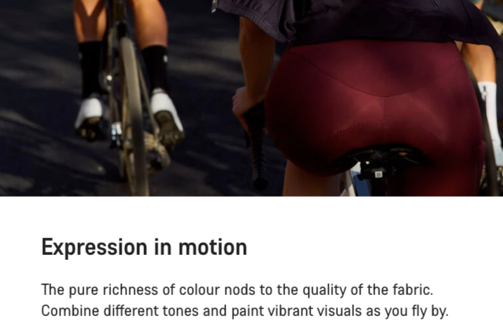
The idiom relevantly describes success, achievement, and a top performance – for me, this speaks not just about the cycling clothing but the people who wear it. It is also a written representation of the optical illusion that happens when you see the apparel in action. When cyclists wearing the collection whizz past you. "Paint vibrant visuals as you fly by."
The problem
How do you market cycling apparel without sounding like a broken record?
What genuinely makes this bib short different from the other?
Who are we speaking to?
How can we market clothing in our brand voice?
How do we balance technical language with accessibility?
And how can we focus on the person buying the product?
The solution:
Make it feel real.
What does it FEEL like to wear these? How would I use it? Why would I buy it? What situations would I find myself in? Does this apparel cement the vision of what kind of cyclist I am?
I put myself in their shoes.
I kept the premium feel.
But I went all-in on vivid imagery.
I wanted people to imagine themselves wearing the item already.
The shift
Good product copy describes the person buying the item and the experience they will have with it, while showing them why it’s the right choice.
Product descriptions are often the last thing a customer reads before they commit to buy. So I approach them with care.
My results are reliable: clear, vivid, and human. They’re not generic, but they’re clean and lively, and make it easy to imagine the product slotting seamlessly into your day to day life. They make the sale a no-brainer.