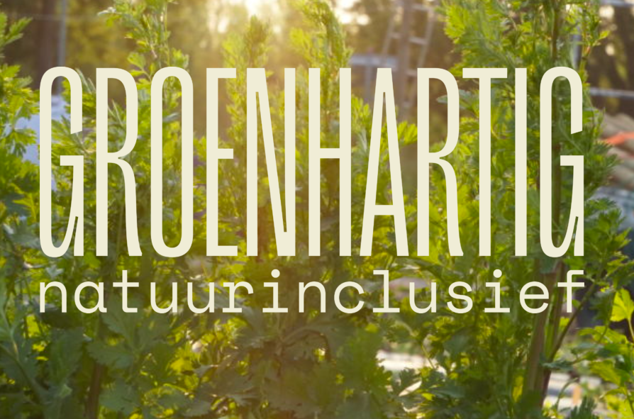
Groenhartig is an ecological market garden on the outskirts of Amsterdam.
They grow veggies for sustainably-minded restaurants, and veggie boxes to the foodies of Amsterdam.
The problem
It was really difficult for people to sign up for a veggie box via the website UX.
Michel would get email after email of people not knowing what to do, and had to reply to each and every one explaining what to do. And not everyone would sign up.
Random bits of information everywhere. People had to to navigate to another page to get more information—and remember it in their heads—before navigating back to commit. No clear steps. No nurture email sequence or email confirmation once people HAD signed up.
And on top of that, the copy wasn’t doing it’s job. It was way too technical, and focussed purely on every tiny detail, as if people were already ready to commit.
The solution
The interesting thing about this project was essentially that it was a case of finding all of the pieces, sorting them into their colours, and putting them back in the right place.
People deserved to know:
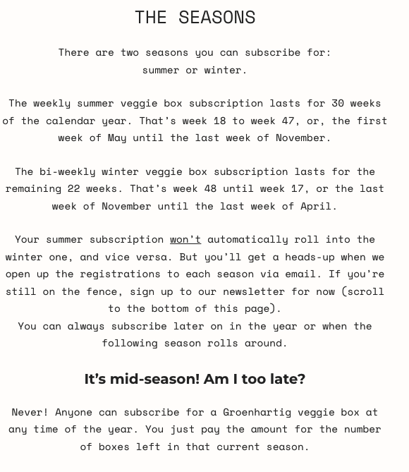
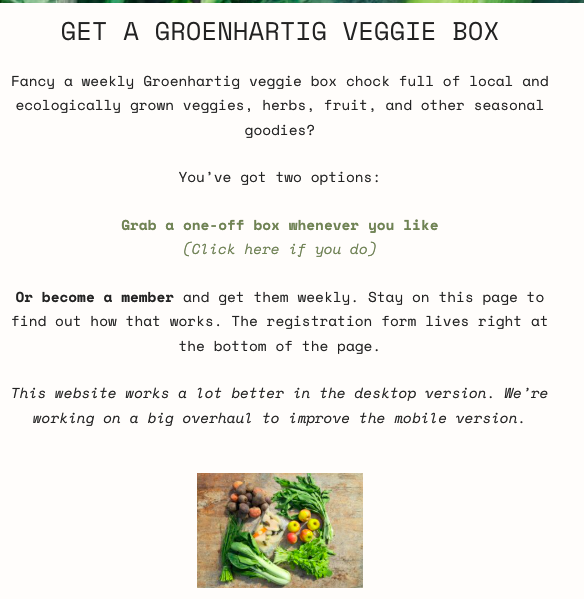
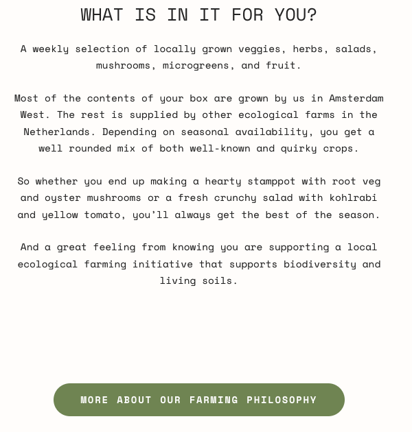
What dates they’d get the veggie box
The contents (or an idea of them)
How much they’d cost
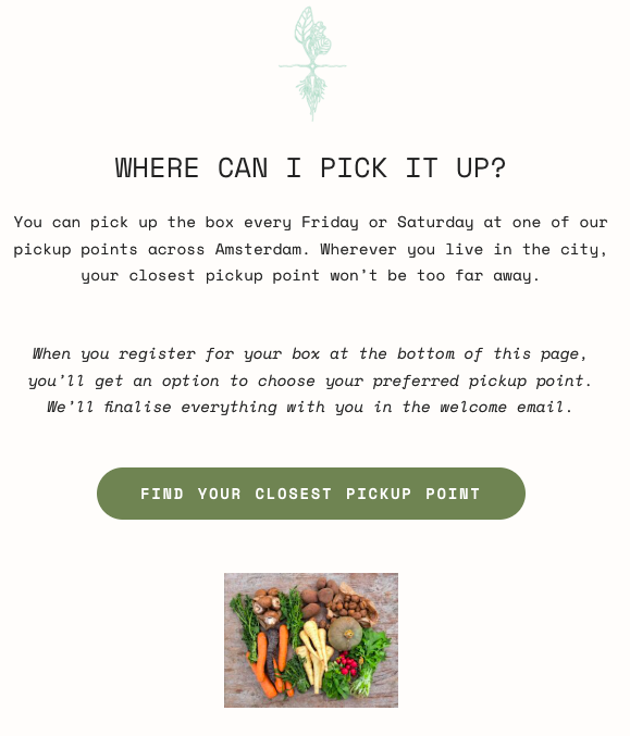
Would they have to pick them up
What else are they getting
What size to get and why
And so much more…
This took a long call with Michel, and he was very patient and thorough in answering my questions in the days following. That way, I had every bit of information I needed to be able to know exactly what would happen, what I needed to do, what I needed to know, and why it’s worth their money.
The results
I could see immediately what was needed:
To be able to distinguish between what information was needed on the website and what could be kept for the onboarding email sequence
To create a website structure that captured attention, built trust, and offered the solution without them having to do anything but read
To speak to people’s values, ethics, and morals
To show the transformation a good glut of veggies will do for them every week
And to provide the right amount of information so that people could think on it and weigh their options without having to manually reach out.
See the live project here.
I re-wrote his tone of voice and spoke as if I were him, having a conversation with an interested client, standing outside his market garden, with the feelings that people normally have when they’re there in front of the poly tunnels and rows of herbs and flowers: curiosity, calm, inspiration.
The change was incredible.
More customers signed up for veggie boxes, more regularly.
When the seasons shifted and it was time to sign up for the winter subscription, things went smoothly.
When they did sign up, they weren’t left wondering where the confirmation email was.
They got a smooth onboarding.
And there was no tension, friction, or unanswered questions. Everything just worked as it should.
That’s the beauty of a customer journey that works. There are no speedbumps. It’s easy for everyone. Additionally, when you’re transparent and clear, your audience knows where they stand, what to do, and why. When you speak with integrity, there’s room to trust you. People stick around for that.